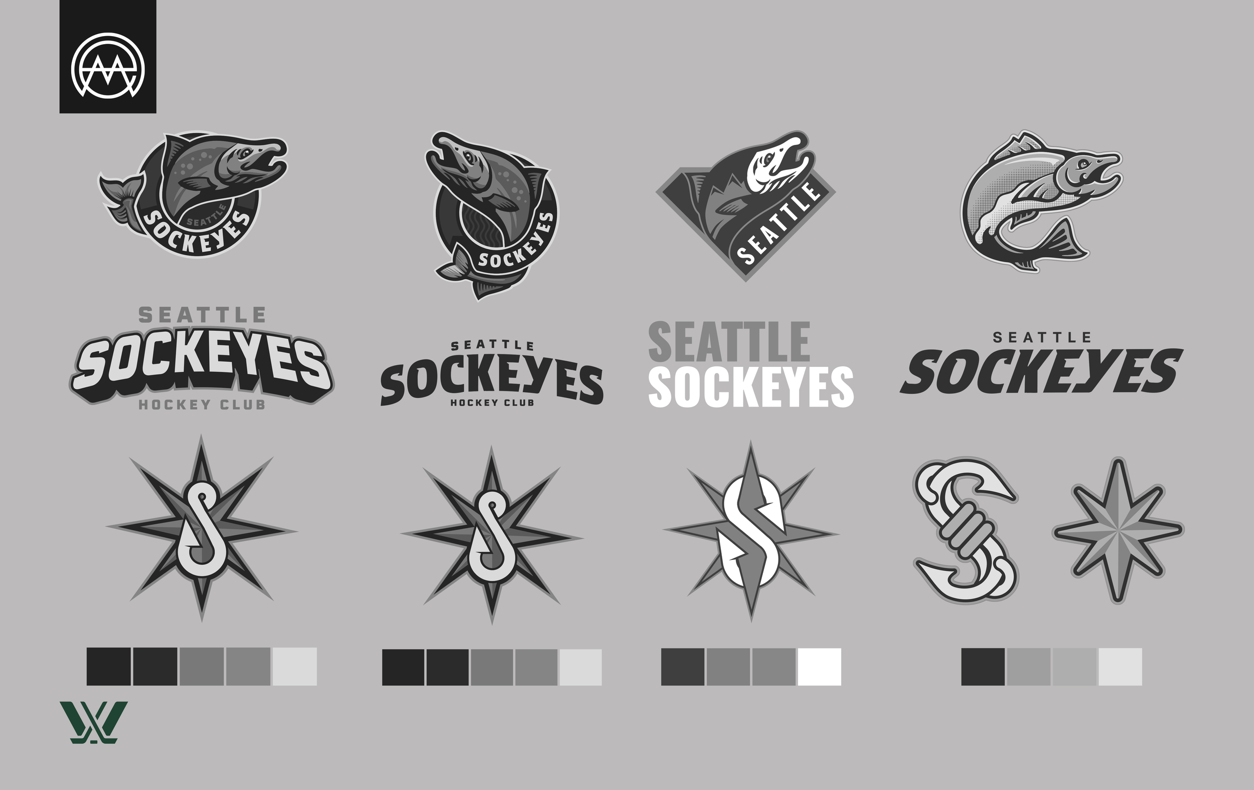
Seattle Sockeye Branding Exercise
With the announcement of the PWHL's expansion to Seattle, I saw an exciting opportunity to explore a professional women’s hockey brand rooted in regional identity and bold visual storytelling. This conceptual project introduces the Seattle Sockeye, a name chosen for its strong ties to the Pacific Northwest’s native salmon species—symbolizing strength, resilience, and connection to the local environment.
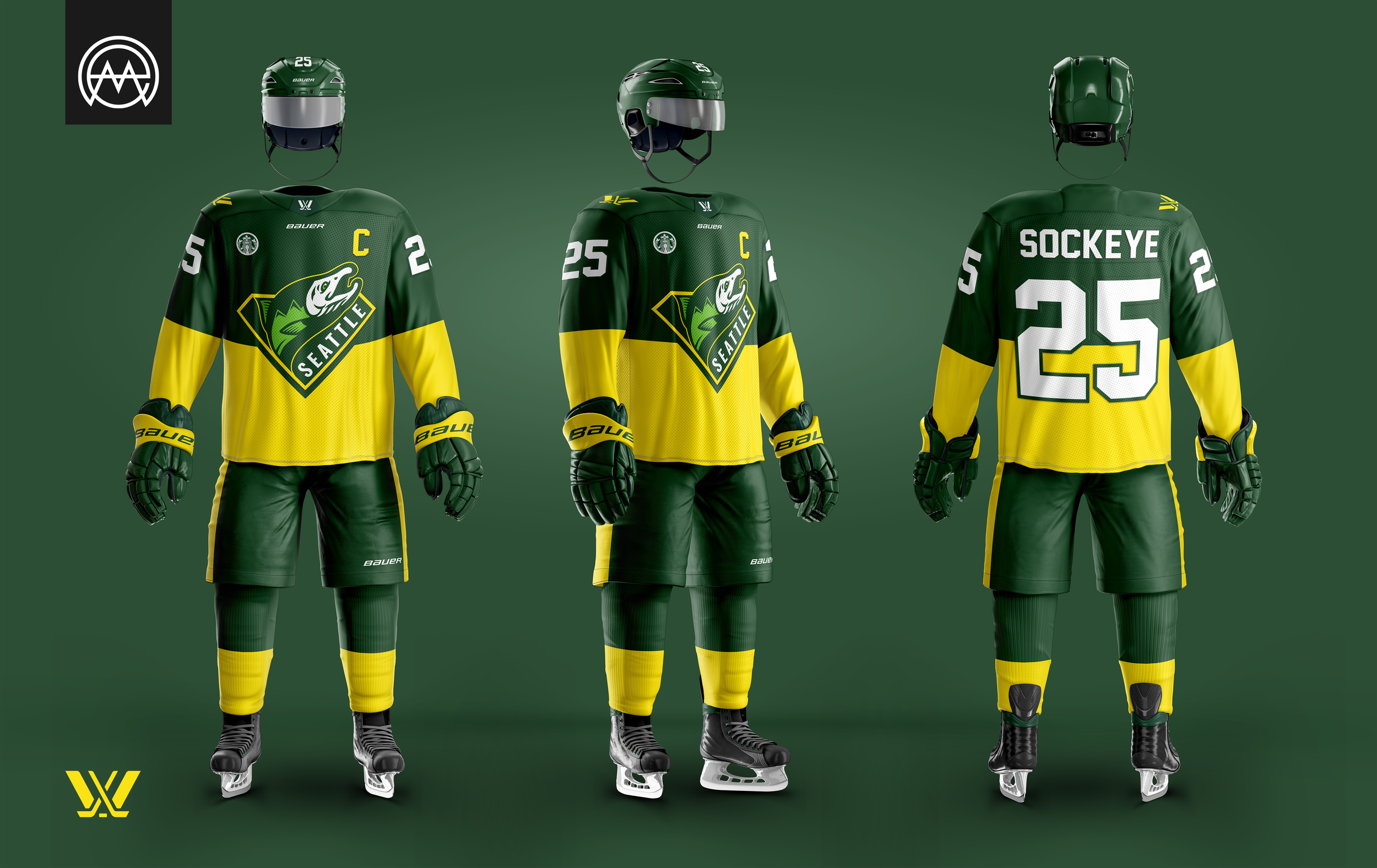
The brand centers around emerald green, as designated by the team, supported by a high-contrast palette that evokes the vibrancy and energy of Seattle’s landscape. The visual identity aims to strike a balance between modern athletic aesthetics and meaningful regional storytelling, designed to resonate with fans and celebrate the spirit of Seattle.